Open-concept interiors look wonderfully simple when they work. The kitchen flows into the dining area, the dining space connects naturally with the living room, and daylight seems to travel freely through the entire home.
But removing walls also removes many of the visual cues that normally tell us where one room ends and another begins.
Without a clear structure, an open floor plan can quickly become a collection of furniture competing for attention. A dramatic kitchen island, oversized sofa, statement pendant, television, artwork, and dining table may all demand to be noticed at the same time.
This is where visual hierarchy in open-concept interior design becomes essential.
Visual hierarchy establishes what the eye notices first, what supports that focal point, and where attention moves next. Designers create it through scale, contrast, furniture placement, lighting, color, materials, and negative space.
When those elements are intentially organized, a large multifunctional room can feel connected without becoming visually confusing.
Start With a Clear Primary Focal Point
Every successful open-plan room needs somewhere for the eye to begin.
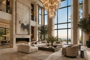
That focal point might already exist in the architecture. A fireplace, large window, dramatic staircase, or garden view can naturally become the visual anchor. In other homes, designers create emphasis using artwork, statement furniture, lighting, or architectural details.
Design professionals often describe emphasis as an important interior principle because it creates a clear point of focus and prevents every feature from competing equally for attention.
The mistake is creating too many “hero” moments.
Imagine an open living area containing a heavily veined marble kitchen island, huge sculptural chandelier, brightly patterned sofa, dramatic gallery wall, and oversized television. Each feature might look beautiful alone, but together they can create visual noise.
Choose one dominant focal point within the main sightline, then allow secondary features to support it.
Hierarchy works because not everything receives the same level of attention.
Use Furniture to Create Secondary Zones
Once the primary focal point is established, furniture can define smaller functional areas.
This is especially useful in open-plan homes where walls are intentionally absent.
A sofa can visually establish the boundary of the living area. A dining table and pendant can form another distinct zone. An island or peninsula naturally identifies the kitchen without physically closing it off.
Architectural Digest has shown how furniture arrangements can divide large open interiors into areas for conversation, reading, television, and dining while maintaining a cohesive overall palette.
The important point is that these zones should feel distinct without becoming isolated.
Rather than seperating every area through completely different colors or styles, repeat selected materials and tones across the room. A walnut dining table might visually connect with timber shelving in the lounge, while black kitchen hardware could relate to a black floor lamp nearby.
The spaces remain different, but they speak the same visual language.
Control Hierarchy Through Scale and Proportion
Size has enormous influence over what we notice first.
Large objects naturally carry more visual weight, which is why an oversized sofa, broad kitchen island, or large artwork often becomes dominant within an open interior.
However, size needs to match architectural scale.
A tiny dining table may look lost inside an expansive open-plan room, while an enormous sectional can overwhelm a narrower space and interfere with circulation.
Proportion also matters between objects. Interior design principles commonly treat proportion and scale as essential tools for keeping furniture and architectural elements visually balanced.
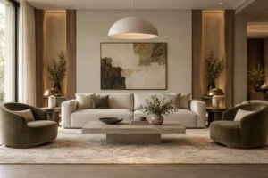
Consider the relationship between a sofa and coffee table. A substantial sectional paired with a tiny table often feels unfinished. A larger table – or a combination of two complementary tables – may create a more convincing composition.
The same applies vertically.
High ceilings can handle taller artwork, larger pendant lights, and stronger architectural gestures. Lower ceilings generally need more restrained elements.
Correct proporton helps the hierarchy feel intentional rather than accidental.
Let Lighting Guide the Eye Between Zones
Lighting is one of the easiest ways to organize an open-concept interior without adding physical barriers.
Think of each fixture as a visual marker.
A large pendant above the dining table immediately communicates that the table is important. Smaller pendants over a kitchen island identify a working zone, while a floor lamp beside an armchair creates a quieter reading area.
Lighting also creates hierarchy through brightness.
The brightest element in a room often attracts attention first, especially at night. Accent lighting can therefore highlight artwork, shelving, textured walls, or architectural details that deserve greater visual importance.
The trick is creating several layers rather than illuminating everything equally.
If every downlight, pendant, wall light, and lamp is equally bright, the space can feel flat. Instead, vary intensity and height so attention travels naturally from one area to another.
This creates visual rhythm while maintaining the openness of the floor plan.
Use Contrast Without Creating Visual Competition
Contrast creates emphasis, but too much contrast creates chaos.
A dark kitchen against pale walls, for example, may naturally become a major visual anchor. You probably do not need another equally dramatic element immediately beside it.
Instead, distribute contrast strategically.
Color is only one option. Designers can also create contrast through texture, material, shape, height, and finish.
A matte plaster wall beside polished stone creates a material contrast. A curved lounge chair surrounded by mostly straight architectural lines creates a shape contrast. A tall indoor tree introduces vertical emphasis among lower furniture.
These differences help establish hierarchy without requiring bright colors everywhere.
The strongest feature should receive the greatest contrast, while supporting elements can remain quieter.
This is where restraint becomes valuable. Recent designer commentary has increasingly emphasized limiting the number of competing statement pieces so focal objects have enough negative space to actually feel special.
Sometimes making one object quieter is more effective than adding another dramatic one.
Protect Sightlines and Circulation
Visual hierarchy is not only about what exists in a room. It is also about what you can see from different positions.
Open interiors often contain long sightlines—from the entrance through the living room, from the kitchen toward the garden, or from one floor to another.
These views should be considered when arranging furniture.
Some residential architecture deliberately uses layered sightlines to maintain visual connections between different functional zones while still giving each area its own identity.
Try standing at the main entrance to your open-plan area.
What catches your attention first? Is it the feature you intended, or are you looking directly at the back of a bulky sofa, tangled cables, or an oversized television?
Then consider movement.
People should be able to travel between the kitchen, dining space, seating area, and exterior doors without constantly navigating around furniture.
Maintaining open circulation creates both practical and visual calm. Furniture can define boundaries, but it should not make movement feel unnecessarily complicated.
Use Rugs, Materials, and Ceiling Details as Invisible Boundaries
Not every zone needs a wall or furniture divider.
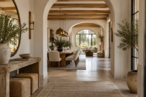
Rugs are particularly effective because they create boundaries at floor level without interrupting sightlines.
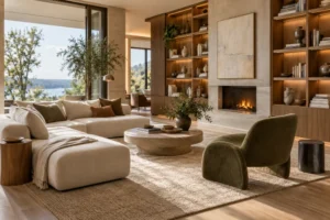
A generously sized rug can visually group a sofa, coffee table, and chairs into one living zone. The dining area beside it can remain on exposed timber or stone flooring, immediately creating a subtle distinction.
Designers also use material transitions and architectural details to organize open spaces. Recent residential projects demonstrate how changes in finishes, ceiling heights, and material treatments can define functions while maintaining openness.
Ceiling treatments can work in a similar way.
A dropped ceiling above a kitchen, timber detailing over a dining zone, or a decorative pendant suspended within a specific area establishes a psychological boundary even when the floor plan remains completely open.
These subtile signals are powerful because people understand them almost unconsciously.
They tell us, “This is the dining area,” without needing a physical partition.
Leave Enough Negative Space for the Hierarchy to Work
One of the easiest ways to destroy visual hierarchy is to fill every empty area.
Open-concept rooms often tempt homeowners to keep adding furniture because the floor area appears large.
But empty space is not wasted space.
Negative space separates important features and gives your eye somewhere to rest. It also makes transitions between functional areas easier to understand.
A recent analysis of an expansive open-plan living room highlighted how exposed floor area and carefully positioned rugs can define zones while maintaining visual order and flow.
Rather than filling the gap between a dining table and sofa with another console, chair, or plant, consider whether that space actually improves circulation.
The same principle applies to walls.
You do not need artwork covering every available surface. One strong piece with generous empty space around it may provide far greater impact.
Visual hierarchy becomes clearer when important elements are given enough room to breathe.
Understanding visual hierarchy can transform an open-concept interior from a large shared room into a sequence of spaces that feels natural, organized, and easy to navigate.
Start by identifying one primary focal point. Then build supporting zones through furniture, rugs, lighting, scale, materials, and carefully controlled contrast. Protect sightlines and circulation, and resist the urge to make every feature equally dramatic.
Most importantly, use negative space as part of the design rather than something that always needs to be filled.
Walk through your open-plan space and notice where your eyes travel first, second, and third. If everything demands attention simultaneously, simplify the composition.
A few neccessary adjustments in placement, scale, and emphasis can create a much calmer and more sophisticated interior.