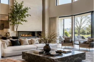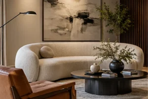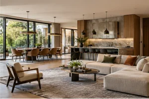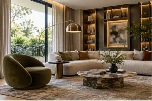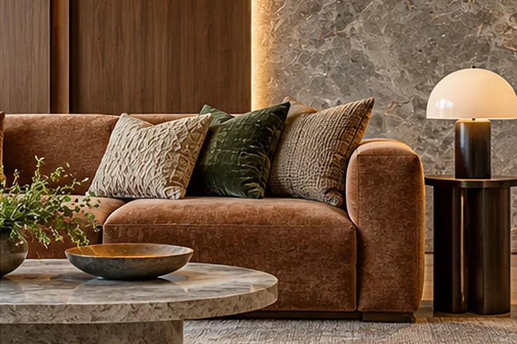
A beautiful sofa can look completely different depending on the room around it. Place warm camel upholstery beside walnut paneling and limestone, and it may feel rich and inviting.
Put the same sofa against cool gray stone, chrome detailing, and blue-toned flooring, and the effect changes immediately.
That is why learning how to coordinate upholstered furniture with architectural finishes matters.
Upholstery is one of the softest visual elements in a room, while flooring, wall treatments, stone, timber, metal, and built-in cabinetry create the harder architectural framework.
Successful interiors allow these two layers to communicate rather than treating furniture as decoration added after construction is finished.
Material specialists increasingly describe interior design as an orchestration of color, texture, light, and proportion rather than a collection of isolated decisions.
The goal is not perfect matching. In fact, sophisticated rooms usually contain contrast.
What matters is creating enough connection through undertones, texture, material repetition, and visual weight that the furniture feels naturally rooted in the architecture.
Start With the Architectural Material Palette
Before choosing upholstery, identify the materials already dominating the room.
Look at flooring, wall finishes, cabinetry, fireplaces, window frames, exposed beams, built-ins, and major stone surfaces. These features usually represent a much larger visual area than any individual chair or sofa.
Interior designer Shalini Misra recommends considering hard materials such as stone and wood alongside soft furnishings from the beginning of a project because together they establish the overall mood.
For example, a room with pale oak floors, warm plaster, and creamy limestone already has a soft, warm material direction.
A room with polished concrete, black steel frames, and dark stone has a very different architectural personality.
Your upholstery does not need to copy those materials, but it should either complement or deliberately contrast with them.
Understanding the background first prevents expensive furniture from feeling strangely disconnected later.
Match Undertones Before Matching Exact Colors
Exact color matching is rarely necessary.
Undertones matter more.
Warm timber such as walnut or oak usually works naturally with upholstery carrying cream, camel, rust, olive, warm gray, or earthy undertones. Cooler stone or concrete may pair comfortably with charcoal, blue-gray, muted green, or cooler off-whites.
Consider a limestone floor with subtle beige veining.
Choosing a beige sofa that matches the floor exactly could make the room look flat. A warmer oatmeal linen or muted tobacco upholstery would maintain the connection while creating enough separation.
Architectural Digest has documented interiors where muted upholstery deliberately echoes limestone flooring, concrete walls, and gray structural finishes, creating continuity without making every material identical.
Always view fabric samples inside the actual room.
Natural and artificial lighting can shift color dramatically, especially with gray, beige, cream, and green fabrics.
A textile that looked perfectly neutral in a showroom may suddenly appear greenishh beside your flooring.
Balance Hard Finishes With Softer Textures
Architectural materials often feel visually solid.
Stone is heavy. Metal can appear precise or industrial. Concrete feels cool. Glass is smooth and reflective.
Upholstery provides an opportunity to soften those qualities.
If a living room contains a large stone fireplace and polished floor, consider linen, wool, velvet, bouclé, or brushed cotton rather than another visually slick finish.
Designer Katie Harbison describes linen, oak, and stone as particularly effective together because each contributes a different quality: softness, warmth, and solidity.
Contrast makes each material easier to appreciate.
A soft wool chair beside travertine emphasizes the tactile quality of the textile while making the stone feel more architectural.
Likewise, velvet upholstery can create richness against matte plaster, while relaxed linen prevents highly polished marble from feeling too formal.
The strongest rooms often balance opposing sensations instead of repeating the same texture everywhere.
Coordinate Upholstery With Timber Finishes
Timber is especially influential because it carries both color and texture.
A dark walnut wall or built-in cabinet already creates strong visual weight. Pairing it with equally dark upholstery may produce a sophisticated cocooning effect, but it can also become heavy if the room lacks sufficient light.
Lighter upholstery creates contrast.
Cream, oatmeal, pale olive, or muted rust can visually lift dark timber while still maintaining warmth.
With pale oak, you have more flexibility. Neutral fabrics create a calm tonal scheme, while deeper green, chocolate, charcoal, or terracotta can add definition.
Architectural Digest has noted the continued use of woods such as oak and walnut throughout flooring, walls, ceilings, and built-ins because natural wood brings warmth and character to interiors.
You can reinforce the relationship through smaller details.
For instance, an upholstered chair might have timber legs that repeat nearby cabinetry. This subtile connection is often enough to make furniture feel integrated.
Let Stone Influence Texture and Visual Weight
Stone frequently acts as the visual anchor of a room.
Marble, travertine, limestone, slate, and granite all contain natural variation, so upholstery should usually support rather than fight those patterns.
Highly veined marble is already visually active.
Pairing it with heavily patterned upholstery may create unnecessary competition. Solid or lightly textured fabrics often allow the stone to remain the architectural feature.
Quieter limestone or travertine offers more freedom.
You might introduce patterned cushions, tactile wool, or richer colors because the stone provides a calmer foundation.
Material-focused interior design increasingly favors combinations of stone, timber, metal, glass, and textiles because their contrasting physical qualities bring warmth and complexity to contemporary spaces.
Pay attention to visual weight too.
A massive stone fireplace may require a sofa with enough scale and upholstery density to balance it. A tiny delicate chair may look disconected beside such a strong architectural feature.
Use Metal Finishes as Small Connecting Details
Metal often appears in window frames, lighting, hardware, stair railings, and furniture bases.
You do not need to repeat the exact finish everywhere.
Instead, think about temperature and intensity.
Black steel works particularly well with charcoal, natural linen, cognac leather, olive, and other grounded colors. Brass can complement warmer upholstery such as rust, ochre, beige, burgundy, or forest green.
Chrome and stainless steel tend to feel cooler and often pair naturally with gray, white, navy, and cooler neutrals.
Metal can also provide contrast against soft upholstery.
ArchDaily notes that metal has evolved from an industrial building material into an increasingly familiar component of intimate domestic interiors and furniture.
One simple strategy is repeating a metal finish in the furniture frame or legs.
A cream armchair with a dark metal base, for instance, can subtly connect with black window frames without making the relationship overly obvious.
Consider Flooring Before Choosing Large Upholstered Pieces
Your sofa sits directly against the visual field created by the floor.
That relationship matters enormously.
If the flooring is highly patterned – such as dramatic stone, parquet, terrazzo, or strongly grained timber – large upholstered furniture can provide visual calm.
If the floor is very plain, upholstery has greater freedom to introduce pattern or stronger texture.
Rugs complicate the relationship slightly because they create another layer between furniture and flooring.
Think of the floor as the architectural base, the rug as the transitional layer, and the upholstery as the softer upper layer.
These elements should not all demand equal attention.
For example, pale oak floors could support a textured neutral rug and a dark green sofa. The flooring remains warm, the rug creates transition, and the sofa becomes the focal point.
A toughtful hierarchy usually feels more sophisticated than attempting to make every material equally decorative.
Use Contrast Instead of Perfect Coordination
Cohesion does not mean making furniture disappear into the architecture.
Sometimes the best decision is contrast.
A soft curved sofa can look exceptional against rigid timber paneling. A deep burgundy chair can energize pale limestone. Cream bouclé can soften black metal and dark stone.
The contrast should still contain one connecting element.
Perhaps the color temperature is similar, the furniture legs repeat a metal finish, or a cushion picks up a tone found in the stone.
Textiles are particularly useful because their variety of color, pattern, translucency, and texture allows them to affect both visual character and the sensory experience of a space.
This gives you flexibility.
You can make the upholstery deliberately different from the architecture while maintaining enough smaller connections to keep the room coherent.
That is often more interesting than simply matching beige furniture to beige walls.
Remember Performance and Practicality
Coordination should never ignore daily life.
The perfect fabric color is not very useful if the upholstery cannot survive the household using it.
Consider pets, children, entertaining, direct sunlight, food, and how frequently the furniture will be used.
Current sofa guidance recommends evaluating upholstery not only through appearance but also through durability, cleaning requirements, household habits, comfort, and expected lifespan.
Performance fabrics may be appropriate for frequently used family rooms, while more delicate textiles can work in formal spaces with lighter traffic.
Modern textiles can also provide functional properties such as stain resistance, acoustic performance, and greater durability.
Architectural finishes are usually long-term investments.
The upholstery you pair with them should ideally age gracefully too.
A beautiful material scheme feels considerably less sophisticated when the main sofa looks worn after a short period.
Test Everything Together Before Committing
Samples are essential.
Collect pieces of upholstery, flooring, timber, paint, stone, and metal whenever possible and view them together inside the actual room.
Do not evaluate them only under bright showroom lighting.
Look at the combination in morning daylight, afternoon sun, and artificial evening light.
Pay attention to more than color.
Does the upholstery feel too smooth beside polished stone? Is every surface matte? Does the timber grain compete with a patterned textile? Does one element visually dominate everything else?
Material coordination is ultimately about relationships.
ArchDaily describes interior surfaces as interconnected decisions where material, light, color, texture, and proportion influence how the entire environment is perceived.
Testing materials together before purchasing helps reveal those relationships while changes are still easy to make.
Coordinating upholstered furniture with architectural finishes is not about creating perfect matches. It is about building relationships between soft and hard materials so the room feels intentional and balanced.
Begin with the architectural palette, then study undertones, texture, visual weight, and material temperature. Let timber, stone, flooring, plaster, and metal guide your upholstery choices without completely controlling them.
Use contrast where the room needs personality and repetition where it needs cohesion.
Before ordering a sofa or chair, bring fabric samples into the actual space and compare them directly with permanent finishes. A few delibarate material connections can make furniture feel less like something placed inside the architecture – and more like an integral part of it.