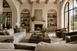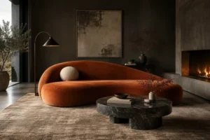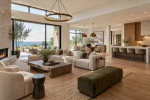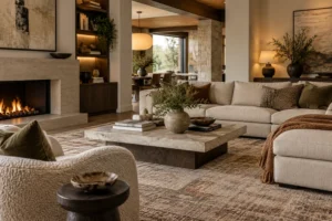
A beautifully furnished living room can still feel unfinished when the walls do not connect with everything happening below them.
The sofa might be perfectly proportioned, the rug beautifully textured, and the lighting carefully selected, yet an awkwardly placed painting or overcrowded gallery wall can throw the entire composition off balance.
That is why wall composition in sophisticated living room decor deserves more attention than simply deciding what to hang.
A successful wall creates a relationship between architecture, furniture, artwork, lighting, color, and empty space. It guides the eye, reinforces focal points, and helps different parts of the room feel visually connected.
The most refined spaces also understand restraint. Not every blank area needs artwork, shelving, or decorative molding.
In fact, Architectural Digest notes that leaving some walls visually quiet can help the eye rest, while artwork above furniture generally benefits from being large enough to relate convincingly to the piece beneath it.
The goal is not to decorate every wall. It is to make each important wall feel intentional.
Start With the Furniture, Not the Empty Wall
One of the most common decorating mistakes is treating the wall as an independent surface.
Instead, begin with the furniture immediately below or in front of it.
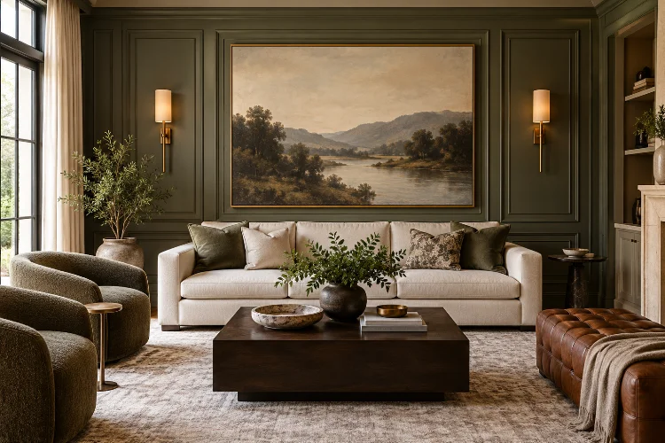
Artwork above a sofa, for example, should visually belong to the sofa rather than simply being centered on the entire wall. A broad sectional usually requires a larger piece of art or a wider grouping than a compact two-seat sofa.
This relationship creates what designers often call visual anchoring.
Architectural Digest suggests that wall art or mirrors above a sofa can occupy roughly 60-75% of the sofa’s width as a useful starting point, although the exact proportion depends on the architecture and artwork.
Scale matters more than following a rigid formula.
A small painting floating above a three-meter sofa can look timid, while artwork that extends far beyond the furniture may overwhelm it.
The wall and furniture should read as one intentially composed zone.
Establish One Clear Wall Hierarchy
Not every wall should compete for attention.
A sophisticated living room usually has a hierarchy. One wall may contain the fireplace and major artwork, while another supports quieter shelving, smaller objects, or simply architectural detailing.
Determine which surface should become the main focal wall.
This could be the wall visible immediately from the entrance, the fireplace wall, or the surface behind the primary sofa.
Once the dominant wall has been established, allow secondary walls to play supporting roles.
If one side of the room contains a large colorful artwork, another wall may need nothing more than a mirror or restrained pair of prints.
The result feels calmer because the eye understands where to look first.
Sophistication often comes from controlling attention rather than creating maximum decoration.
Get Artwork Scale and Spacing Right
Large artwork can transform a living room because it creates instant visual authority.
It is especially effective on substantial walls, where several tiny pieces may appear disconnected. Architectural Digest has highlighted the importance of giving oversized artwork enough visual breathing room so it can be appreciated without surrounding objects competing with it.
Gallery walls work differently.
Instead of relying on one dominant object, they create collective visual weight through several smaller pieces.
Spacing becomes crucial here.
If frames sit too far apart, the collection looks fragmented. If they are packed too closely, the arrangement can feel crowded. Treat the entire gallery as one large composition rather than multiple unrelated pictures.
A shared frame color, repeated palette, similar matting, or consistent spacing can create unity even when the art styles differ. Both Architectural Digest and Homes & Gardens recommend using some common visual element to make varied gallery arrangements feel cohesive.
The individual pieces may vary, but their overall proporton should relate to the furniture and architecture around them.
Choose Between Symmetry and Asymmetry
Symmetry naturally communicates order.
Two framed pieces positioned evenly above a console, matching sconces surrounding artwork, or identical shelving units on either side of a fireplace can make a living room feel formal and composed.
It works particularly well in rooms with traditional architecture or strong central features.
Asymmetry creates a more relaxed effect.
You might place a large painting on one side of a console and balance it with a sculptural lamp and smaller objects on the other. The two sides are not identical, but their visual weight feels comparable.
Gallery walls can use either approach.
A clean grid offers structure and works beautifully in minimalist interiors, while irregular arrangements introduce energy and personality.
Homes & Gardens notes that symmetrical layouts can create calm order, while more eclectic groupings allow personal collections to develop naturally.
Neither method is inherently more sophisticated.
The best choice depends on the character of the room.
Use Wall Paneling as Part of the Composition
Artwork is only one way to create an interesting wall.
Paneling, molding, timber slats, textured plaster, stone, and built-in joinery can give the wall itself enough architectural presence that relatively little decoration is needed.
Paneling is particularly useful because it introduces rhythm and proportion.
Square or rectangular molding creates an underlying grid, which can then guide artwork placement. Rather than hanging a picture randomly, you can position it within a panel so the architecture becomes a natural frame.
Homes & Gardens notes that wall paneling can add depth and texture while also providing a structural backdrop for paintings and photographs.
Contemporary spaces can use much simpler versions.
A single horizontal timber detail, narrow fluted panels, or tonal molding painted the same color as the wall can create a subtile layer without making the space feel traditional.
When the wall already has architectural character, avoid overloading it with accessories.
Let Negative Space Become Part of the Design
A large empty wall often creates anxiety.
The immediate reaction is to fill it.
But negative space can be one of the most valuable components of sophisticated wall composition.
An oversized artwork surrounded by generous empty wall area often feels more luxurious than several objects squeezed around it. The blank area increases the perceived importance of the piece.
Designers interviewed by Homes & Gardens similarly recommend not being afraid of empty space on large living room walls because it gives the eye somewhere to rest.
Negative space also separates visual zones.
For example, leaving an empty section between a fireplace composition and nearby shelving can prevent the two features from merging into one overly complicated wall.
Think of blank space as punctuation.
Without pauses, the entire room becomes one long visual sentence.
Integrate Wall Lighting Into the Composition
Lighting should be considered before the wall is fully styled, not afterward.
Picture lights can emphasize individual artwork, while sconces placed beside a painting introduce symmetry and architectural structure.
Wall lighting can also create depth after dark.
Homes & Gardens recommends wall lights as accent lighting for artwork, books, and architectural features, particularly when combined with other sources such as floor and table lamps.
Placement matters.
A picture light should feel related to the dimensions of the artwork rather than floating independently above it. Likewise, sconces positioned beside a mirror or artwork should have enough breathing room to avoid visually crowding the central object.
Lighting itself may also become part of the composition.
A pair of sculptural brass sconces can provide enough interest that additional wall decoration becomes unnecessary.
This is a useful strategy in sophisticated interiors, where fewer well-positioned elements often create greater impact.
Balance Hard Architecture With Softer Layers
Walls are naturally hard architectural surfaces.
Furniture, fabrics, curtains, and plants help soften them.
This interaction is important when designing a living room dominated by paneling, stone, dark paint, or large amounts of artwork.
For example, a dark paneled wall might feel heavy when paired with equally heavy furniture. Introducing a pale upholstered sofa, linen curtains, or a softly textured rug can balance that visual weight.
Curtains also affect wall composition more than many people realize.
Floor-to-ceiling drapery introduces vertical lines and can visually increase the perceived height of the room. When installed close to artwork, its folds become part of the wall’s rhythm.
Plants provide another softer layer.
A tall tree positioned near artwork can create asymmetrical balance, while smaller greenery can bridge the gap between furniture and wall decor.
The strongest wall compositions are never truly seperated from the rest of the room.
They respond to everything around them.
Avoid Decorating Every Wall the Same Way
Consistency is useful, but repetition can easily become predictable.
If every wall contains a centered artwork above a piece of furniture, the room may start to feel staged rather than sophisticated.
Vary the compositions.
One wall might feature one oversized painting. Another could use architectural paneling and almost no decoration. A third might contain a compact gallery arrangement, while the wall near the windows remains mostly empty.
These differences create visual rhythm.
The key is maintaining common threads – perhaps through frame finishes, colors, materials, or artwork styles – so each composition still belongs to the same interior.
Think of your living room walls as separate chapters within one story.
They should not repeat exactly the same information, but they should clearly feel as though they belong in the same book.
Sophisticated wall composition is about much more than filling blank surfaces. It depends on relationships between artwork, furniture, architecture, lighting, scale, and negative space.
Begin by identifying your focal wall and allowing other surfaces to support it. Match artwork to the scale of the furniture below, decide whether symmetry or asymmetry suits the room, and use paneling or architectural texture where the wall itself deserves greater presence.
Most importantly, resist decorating every available area.
Walk into your living room and notice which wall attracts your attention first. Then ask whether everything around it strengthens that focal point or competes with it.
Editing a few pieces, changing artwork scale, or simply leaving more space can often make the entire room feel considerably more refined.