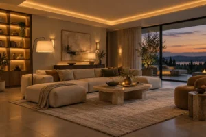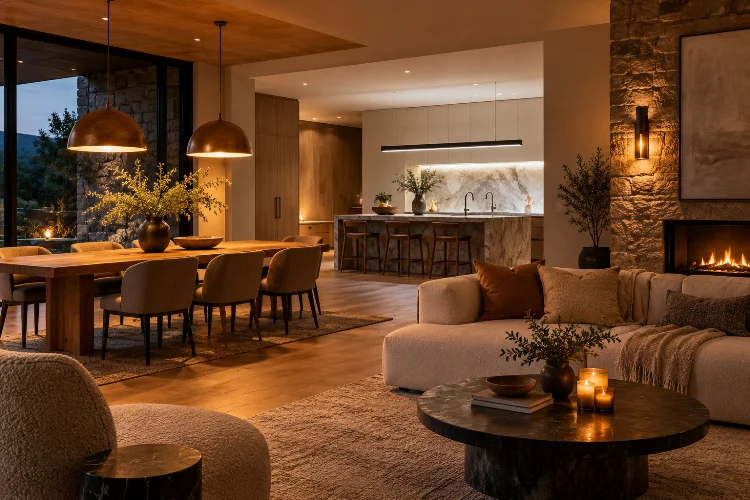
Luxury lighting is not simply about choosing an impressive chandelier or installing expensive architectural fixtures. Two rooms can use equally beautiful fittings yet create completely different experiences because the color of their light is different.
That difference is largely controlled by color temperature.
Understanding color temperature in luxury residential lighting helps homeowners and designers decide whether a room should feel intimate, crisp, dramatic, relaxing, or energizing.
Measured in Kelvin (K), correlated color temperature describes the visual appearance of white light, ranging from warmer yellowish tones at lower values to cooler, bluer tones at higher values.
In high-end residential design, choosing the right temperature also affects how timber, stone, paint, textiles, artwork, and metal finishes appear after sunset.
The objective is not to choose one Kelvin value for an entire house and forget about it. A refined lighting plan responds to function, architecture, materials, and time of day while keeping neighboring spaces visually connected.
Understand What Kelvin Actually Means
Kelvin does not measure how physically hot a light bulb becomes.
It describes the appearance of the light.
Lower numbers such as 2200K or 2700K produce a warmer, more golden effect, while higher values such as 4000K or 5000K appear progressively whiter or cooler.
ENERGY STAR identifies 2700–3000K as warm white territory, while values around 4000K and above produce a cooler appearance.
This can initially feel counterintuitive because a lower “temperature” looks visually warmer.
For luxury interiors, the distinction matters because white marble under 2700K does not look exactly the same as it does under 4000K. Neither is automatically correct.
The best choice depends on the mood and material palette you want to reveal.
Use 2700K to Create Residential Warmth
Around 2700K is one of the safest starting points for living rooms, bedrooms, dining rooms, and other areas designed primarily for relaxation.
The U.S. Department of Energy describes 2700K as warm and appropriate for homes, while current interior lighting guidance frequently places warm residential ambient light around 2700–3000K.
Warm light works particularly well with oak, walnut, brass, limestone, cream textiles, leather, and earthy paint colors.
It can also recreate some of the familiarity associated with traditional incandescent lamps.
However, warmer is not always better.
Extremely warm lighting used everywhere can distort cooler materials and make crisp contemporary interiors feel overly amber. Think of 2700K as a mood choice rather than a universal rule.
Consider 3000K for Cleaner Contemporary Spaces
For contemporary luxury interiors, 3000K often provides a useful middle ground.
It remains warm enough to feel residential but tends to appear slightly cleaner and less golden than 2700K. This makes it particularly effective in kitchens, modern bathrooms, dressing rooms, and interiors dominated by pale stone or cleaner architectural lines.
Architectural Digest notes that designers often favor warm light below 3000K when creating inviting residential atmosphere, particularly when it is layered through ambient, task, and accent fixtures.
A sophisticated home might therefore use 2700K in a lounge but 3000K in an adjoining kitchen.
The difference can work when handled carefully, especially if transitions are gradual.
What usually feels less refined is an accidental mixture of very warm and very cool white light within one visible open-plan space.
Match Color Temperature to Interior Materials
Lighting should be selected alongside finishes, not after them.
Warm timber typically responds beautifully to lower color temperatures because the light reinforces its natural red, amber, and brown tones. Brass, bronze, warm stone, and neutral fabrics often benefit in a similar way.
Cooler stone creates a different challenge.
Carrara marble, blue-gray paint, stainless steel, or cooler concrete may appear cleaner under approximately 3000K than under extremely warm light.
The goal is not simply to make every material appear warmer.
Luxury lighting should reveal the intended character of the surface.
Always test samples under the exact lighting specification whenever possible. Even products carrying the same nominal color temperature can appear subtilely different because CCT is only one part of perceived light quality.
Federal lighting guidance notes that products with the same stated CCT may not necessarily look identical.
Do Not Ignore Color Rendering Quality
Kelvin explains the apparent warmth or coolness of white light, but it does not tell you how accurately colors will appear.
That is where color rendering becomes important.
The Illuminating Engineering Society defines CRI as a measure of how much the colors of objects shift under a light source compared with a reference source at a comparable color temperature.
This matters enormously in luxury interiors.
A beautifully selected burgundy velvet, walnut cabinet, painting, or natural stone can look surprisingly dull under a light source with poor color rendering.
For residential design where materials and finishes matter, many designers look for CRI values around 90 or higher rather than choosing lamps based only on Kelvin.
Homes & Gardens likewise recommends consistent high-quality color rendering when planning sophisticated home lighting.
A toughtful specification therefore considers both CCT and color rendition.
Keep Visible Lighting Zones Consistent
A common lighting mistake occurs in open-plan homes.
The kitchen uses bright cool-white downlights, the dining pendant uses warm bulbs, and the living room lamps introduce another temperature entirely.
Each area may look acceptable individually, but together they feel disconnected.
Consistency is especially important when several zones are visible simultaneously. Recent designer guidance recommends maintaining a consistant color temperature across related lighting sources to create a more cohesive appearance.
That does not mean every fixture must use identical bulbs.
You might maintain 2700K throughout the main living and dining areas while allowing 3000K task lighting inside kitchen cabinetry where greater clarity is useful.
What matters is avoiding abrupt color shifts in the primary field of view.
Luxury interiors usually feel calm because lighting relationships are controlled rather than accidental.
Use Dimming to Change Mood Without Changing Kelvin
Brightness and color temperature are different variables.
A 2700K lamp remains 2700K whether it is bright or dim unless the light source specifically includes warm-dimming technology.
This is why dimming controls are so valuable.
Architectural Digest recommends dimmable fixtures as part of flexible mood lighting because one space may need brighter illumination while entertaining and softer light later in the evening.
Imagine a formal living room.
During a gathering, architectural lighting can run at higher levels while table lamps and accent lights support it. Late at night, ceiling lighting might be reduced while sconces and lamps create smaller pools of illumination.
The room changes emotionally without replacing any fixture.
In larger luxury homes, separate circuits for ambient, task, decorative, and accent lighting provide even greater flexibility.
Consider Warmer Light for Evening Atmosphere
Light does more than change how a room looks.
Its timing also matters.
Interior lighting specialists often recommend moving toward warmer and softer illumination later in the day, while cooler and brighter light may be more suitable for alert daytime tasks.
This is especially relevant in bedrooms, lounges, libraries, and spa-like bathrooms.
A home office might function comfortably with relatively neutral task lighting during working hours but transition toward warmer lamps once work finishes.
Some advanced residential systems use tunable or warm-dim technology to create these shifts automatically.
The result can feel particularly luxurious because the lighting environment responds to daily routine rather than remaining static.
Luxury, in this sense, is flexibility.
Layer Fixtures Instead of Searching for One Perfect Temperature
Color temperature works best when combined with good lighting hierarchy.
Ambient light creates general visibility. Task lighting supports activities. Accent lighting highlights art, materials, and architecture.
Architectural Digest and Homes & Gardens both emphasize this layered approach rather than relying on one overhead source.
The temperature of each layer should make sense within the overall composition.
For instance, warm 2700K ambient lighting could be combined with similarly warm accent lighting around artwork, while kitchen work surfaces receive slightly more neutral illumination.
The difference should feel delibarate, not accidental.
This is also where luxury lighting becomes less about individual fixtures and more about choreography.
The eye notices the illuminated architecture, materials, and atmosphere before it notices the technical specification behind them.
Color temperature has a major influence on how luxury residential interiors feel after dark. Lower Kelvin values generally create warmer, more intimate environments, while slightly cooler temperatures can provide additional clarity in task-focused or contemporary spaces.
But Kelvin should never be considered alone.
Material colors, CRI, brightness, dimming, room function, and adjacent lighting zones all affect the final experience. The strongest residential schemes layer these variables rather than searching for one universal bulb.
Before finalizing your lighting, test the actual sources against timber, stone, upholstery, paint, and artwork inside the home.
A small adjustment from 2700K to 3000K – or simply choosing better color rendering – can completely change how expensive materials are perceived and make the entire interior feel more refined.